P/T/H P/T/H

MMXV Spring & Fuckin’ Summer

MMXV Spring & Fuckin’ Summer

Page Three Hundred, Est. 2014—Turin

Independent Clothing Label & Studio

from A to B

(fear of B)

† † †Thoughts about (1) The State of Things, (2) The inability to see the obvious, (3) Waiting to happen, (4) That’s where I draw the line, (5) The Dunning–Kruger effect, (6) What’s the meaning of ‘Context’, (7) Tell them what you are going to tell them, then tell them, then tell them what you told them, (8) Work: what you get paid for, (9) A few things I personally take care of, (10) Meeting expectations, (11) I no longer like what I used to like, (12) Beauty in the ordinary, (13) What Truth is, (14) How Perception affects Truth, (15) A story of a story of a story, (16) Where I come from, where I’m going, (17) Feeling the Earth’s rotation, (18) We could have done differently, we could have done better, (19) Time for Sticks and Stones
.0

“Attraction and repulsion being undeniably the sole properties by which matter is manifested to mind, we are justified in assuming that matter exists only as attraction and repulsion.” (*)

Everything we have experienced, the entire universe as we perceive it, is systematically ranked according to these standards. But at the very moment in which something is perfectly balanced between these two forces, awaiting judgement, unclassified, it becomes pure indetermination. Grey.

VANILLA—Love At First Sight Manifesto.

(*) Edgar Allan Poe

* * *

Page Three Hundred / Independent Clothing Label, Est. MMXIV—Turin

The Dictatorship of Mannerism, Compendium on the Correlation between Concept and Form.

[...] To make a table it takes the wood, to make the wood it takes the tree, to make the tree it takes a seed, to make the seed it takes a fruit, to make the fruit it takes a flower, to make the flower it takes a branch, to make the branch it takes a tree, to make the tree it takes a wood, to make the wood it takes a hill, to make the hill it takes the ground, to make the ground it takes a flower [...]

Everything is Derivative, Axiom n. 1, Variances over Analogies.

On Aurait Pu Faire Différemment, On Aurait Pu Faire Mieux.

1st Block

† † †(20) We are here to stay, (21) Three bags full, (22) Establishing the settings and giving background details, (23) Understanding and avoiding denial, (24) Denial of denial, (25) Main classification criteria: desirable, undesirable, can be ignored, (26) It seems that water has no colour, (27) So why is the sea blue, (28) Because it reflects the colour of the sky, (29) Things in the right way,

† † †(30) Embracing Incoherence, (31) Three days, three hours, eleven minutes, twenty–seven seconds late, (32) Self Made Men, (33) To love and beg, (34) It is a lapse of time, it is a unit of measurement, it is a volume, it is a fuckin’ name, (35) Some earlier stories that flow into the main one, (36) And other boundary information, (37) #FFFFFF, (38) #000000, (39) The Big Bang, (40) Fifty–one percent of a group can reach a wrong conclusion, (41) Good intentions can still be wrong, (42) A lie believed is still a lie, (43) Unfortunately, bad news can be true, (44) Telling it like it is, (45) Making Distinctions, (46) Non–verbal Communication and Power Dynamics, (47) Failing to recognize the extremity of one’s inadequacy, (48) At first I thought her laughter was sweet, (49) Conflict Resolution, (50) Otherwise known as Reconciliation, (51) When time will cease to flow,

Sticks And Stones May Break My Bones But Words Will Never Hurt Me
1. ) IN What I am, What I have been. What I think to be. What others think I am. What I think others think I am. How other's memory of the past myselves influences the current myself. How my own memory affects what I am. I am the Least Common Multiple, I am the leitmotif of all myselves. Is My Time Well Spent?

2. ) STAY QUIET “A thing’s place was no longer anything but a point in its movement, just as the stability of a thing was only its movement indefinitely slowed down.”( ‘Architecture, Mouvement, Continuité’ n. 5, October 1984|‘Of Other Spaces: Utopias and Heterotopias’ — Michel Foucault )

3. ) OUT According to the Principle of Mass Conservation, what exists now has always existed: no new matter can come into existence where there was none before. An explicit statement of this, along with the further principle that nothing can pass away into nothing, is that it is impossible for anything to come to be from what is not.

† † †(52) Better to go back tomorrow, (53) The universal skepticism toward metanarratives is itself a contemporary metanarrative, (54) We are all losers, (55) A pint of your finest please barkeep, (56) All–embracing, all–absorbing, harmonious, (57) Is it possible to stand still, (58) Crystal clear, (59) Truth is what corresponds to reality, (60) Truth is what matches its object, (61) It is the way things really are, (62) A man robbed two banks after covering his face with lemon juice in the mistaken belief that, because lemon juice can be used as invisible ink, it would prevent his face from being recorded on surveillance cameras, (63) Why am I still myself despite I’m systematically changing every day, (64) What is the leitmotif of all myselves, (65) Is my time well spent, (66) Leave a legacy.
.II
Collection Prelude,
Introducing: from A to B (fear of B)
P/T/H Label & Studio Spring/Summer MMXV Capsule
©
Designed in Turin
2014—2015

2nd Block

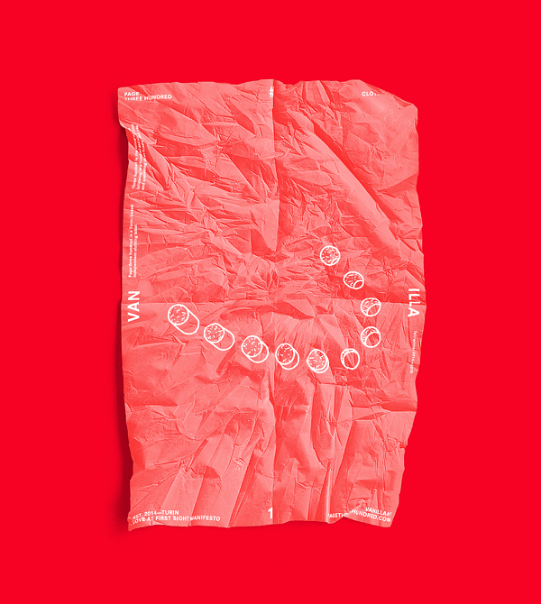
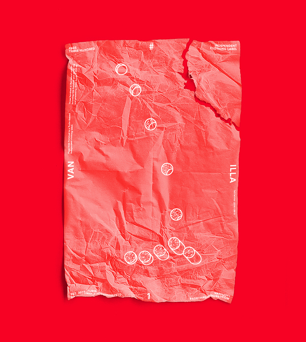
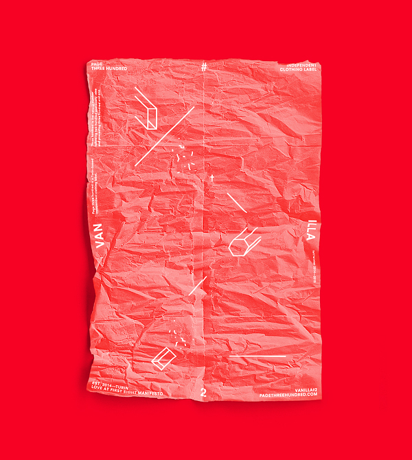
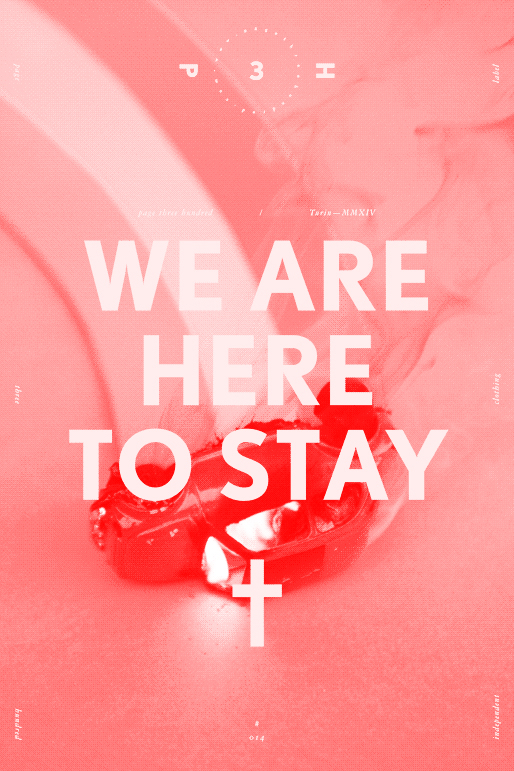
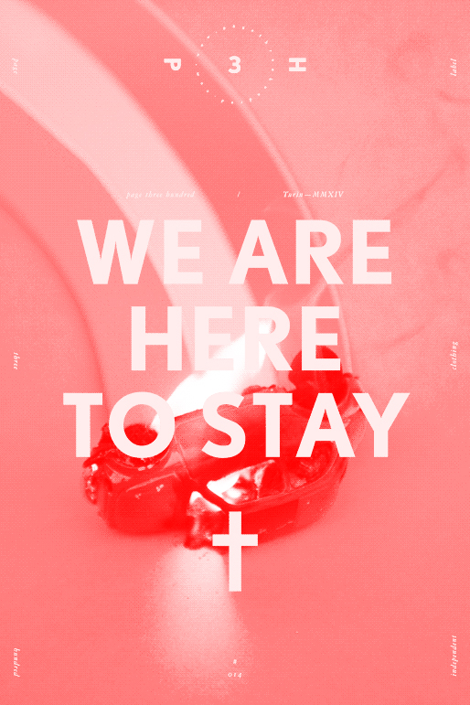
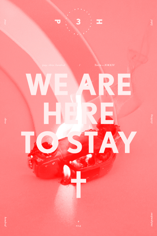
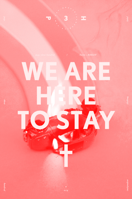
VANILLA, Love At First Sight Manifesto . Poster Series ( 2014—2015 )
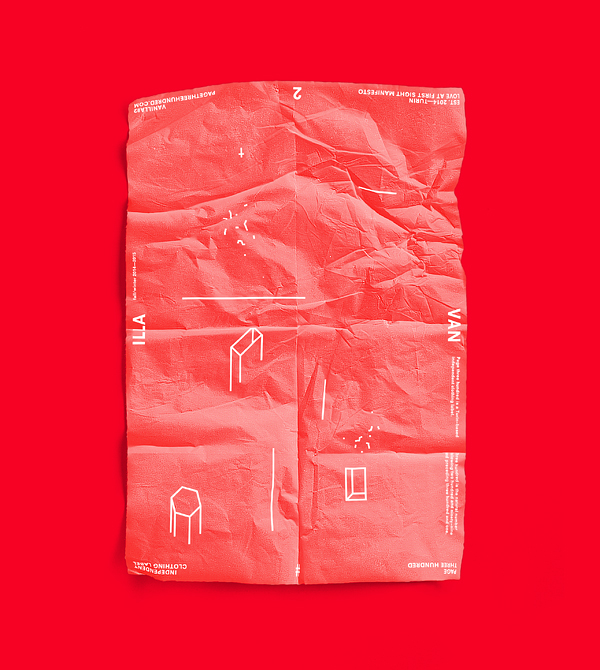
† † †VANILLA, adjective: unexciting, boring, bland, standard. Preferring an activity or thing in its basic and unmodified state. Refers to vanilla ice cream. Used when expressing a preference for having something the traditional way. (+) Synonyms: plain, simple, banal, ordinary, unflavored, neutral, common, generic, conventional, normal. (*Love At First Sight Manifesto*) We believe in the crossbreeding of conflicting influences and attitudes into something uncertain, inconsistent, paradoxical but still organic, like a mongrel dog. We don’t like ‘love at first sight’ stuff, we want doubt, hesitation. Between Black and White we go for Grey.

VANILLA, Love At First Sight Manifesto . Poster Series ( 2014—2015 )

Collection Released on:
Monday, the 18th of May 2015 ( Part I. )
Wednesday, the 12th of August 2015 ( Part II. )
Available by Order Only: hello@pagethreehundred.com
LOOKBOOK PART I.LOOKBOOK PART II.

3rd Block

October 2015

An Excerpt from an Interview on:
A2Z Fashion Magazine, 2nd B Issue — Blue

( ABOUT )“A2Z fashion Magazine is a London based print and online editorial magazine focusing on emerging and established talents in the worlds of fashion, art and culture.

A2Z publishes fashion stories produced by some of the industries freshest creatives both in London and beyond alongside insights and interviews with forward thinking designers and artists.”

www.a2zfmagazine.com


A lot of your work seems to be quite symbolic, starting with the name of your brand, Page Three Hundred. Is there a specific reason you chose to express yourself through such method?

(1) We are much more interested in the subjective interpretations of a content rather then in its didactic – objective description. It’s inevitable that, as human being, we are led to attribute meanings and try to find logical explanations for what is not immediately and clearly understandable. There’s an expression of Matthew Sullivan stating: “a half thought out expression is always heard by another as a whole expression”; we are fascinated by the ambiguity of how a decontextualized message can be perceived and comprehended, even enriched and completed by the reader. This kind of approach strongly affects the way we conceive our own work: we constantly try to embrace incoherence and non–linearity, to legitimize them.
So the name Page Three Hundred reflects this method, this philosophy. A page is a physical support on which an idea can be concretized, expressed, spread. From the Holy Bible to Mein Kampf. Three Hundred is the non–idea, the non–message. Like any other number, it is pure, sterile, aseptic nonsense. It is a definite link in an endless chain. It is ordered, but meaningless. It is the paradox of a signifier which lacks any signified. It means nothing but itself.

pg. 300


You identify with both an independent clothing brand and a creative studio. Which do you feel more strongly towards?

(2) We could say both, in the same way, at the same intensity.


From the clean cuts in your graphic design, we can tell you’ve taken inspiration from Swiss style. Is that correct? If so, are there any reasons for this preference? How does it work with your label?

(3) The clean aesthetic typical of the modernist movement originated from the urge to cut off every unnecessary, redundant element in order to focus in a straight way on the message, to make it clearly and immediately understandable. Grid systems and structured visual languages aimed to emphasize this hyper–linear narrative through a formal organization, they contributed to convey principles of functionalism, objectivity and rationalism. Then the postmodern aesthetic of the 70s–90s took position against the orthodox, totalitarian conformism of modernist avant–gardes by dismantling every formal dogmas of clarity, synthesis and structure and every conventions such as legibility in favor of a chaotic, disordered, emotional, anarchic approach to design.
What is happening nowadays, which could be defined as second postmodern wave or post–postmodernism (to which we strongly feel to belong), is a come back to an aesthetic and visual language typical of the late modernist design but with the denial of any ideology, with the paradoxical aim to make clearly legible a non–message. It is the contempt for linear narrative. It is the uneven mixing of antithetical forms and directions. The message is extrapolated from its context, exposed without any key to interpretation, without any critical connotation, without any point of reference, deprived of its own meaning. The message is that there’s no message. The ideology is that there’s no ideology. The meaning is that there’s no meaning. Absurd is the new logic.

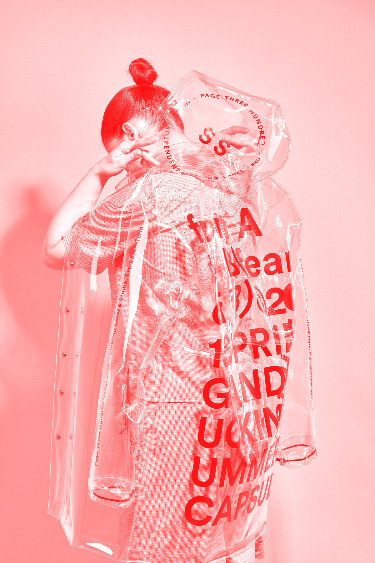
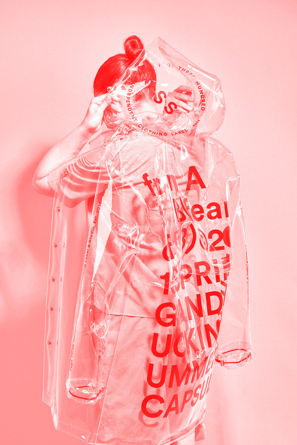
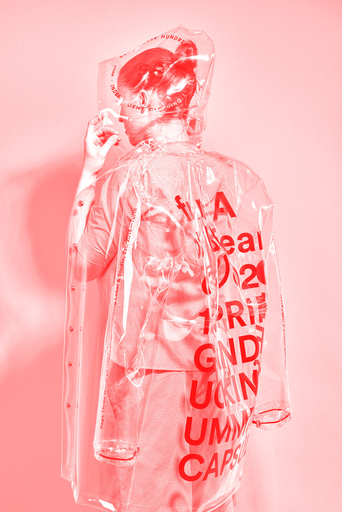
from A to B (fear of B) MMXV Capsule Collection · Printed Acetate Raincoat


Do you take inspiration from literature? There are a lot of written words on your products, including the packaging. How does it affect your work?

(4) Indeed, we do take inspiration from literature as well as from philosophy, even from mathematics. One of our most inspiring figure is Bertrand Russell, physicist, logician and mathematician who, thanks to his Russell’s Antinomy, had a remarkable role in demonstrating that the attempt to found the basis of mathematics entirely on logic led to a contradiction. His work was one of the main causes of the deep crisis concerning the certainties on which mathematics, physics and philosophy of the 20th century were based, and the resulting collapse of the positivist positions. We could say that he laid the foundations for what would become the postmodern thought.
Regarding the use of written words in our work: we find textual content very interesting because of its ambivalence; it is a form of communication extremely straight as it doesn’t add formal attribute to the content, resulting kind of neutral and invisible comparing with image–based content. But at the same time it is also a form of communication mediated by a codified – abstract system, so artificial and unnatural, in some way indirect. On the other hand the neutrality of textual content is balanced by typography, which communicates in itself, but in a more subtle, subliminal way.


You said your label is “Influenced by contemporary aesthetics and defined by a postmodern, skeptical, nonsense attitude”. How does that relate to the fashion market, or even the current generation?

(5) We don’t care much about fashion market. There’s a contemporary trend on the way we enjoy subjects on new media, which caused the success of Tumblr or other websites like FFFFOUND!, which basically aggregate different contents — photography, graphic design, art, pornography, etc — all mixed together in a messy, unorganized way, favoring a more superficial consumption but not for that of lesser value, simply offering a more open interpretation free by imposed meanings. And we just feel to endorse this trend.

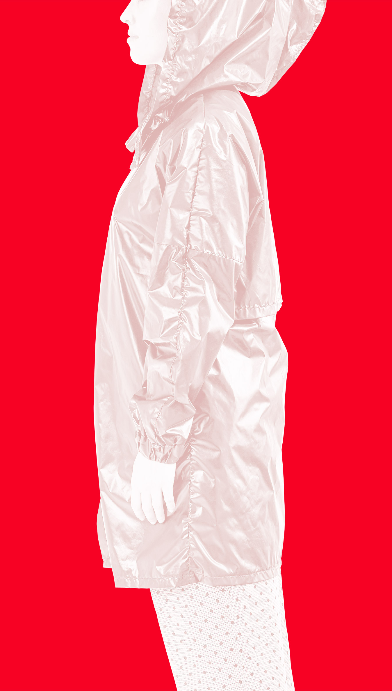
from A to B (fear of B) MMXV Capsule Collection · Oversize Black Kimono Raincoat


Your GRRRREY collection deals with the concept of uncertainty and doubt. How is that shown through your garments?

(6) That concept is a sort of leitmotiv we try to carry throughout all of our works. It’s more like a declaration of intent. We are fascinated by that feeling of uncertainty which takes place when we are at the same time and with the same intensity attracted and repelled by something, and we don’t know yet if we’ll love or if we’ll hate that thing. Now, to be more specific about the GRRRRREY collection, we decided to show this mood through the use of basic forms and desaturated colours.


What makes Page Three Hundred differ from other independent clothing brands or creative studios?

(7) We don’t feel the need to differentiate us from others brands or studios: instead, we feel proud to belong to a movement, to belong to a school of thought. Everything is derivative.

from A to B (fear of B) MMXV Capsule Collection · Printed Acetate Raincoat

unpin

October 2015

An Excerpt from an Interview on:
A2Z Fashion Magazine,
2nd B Issue — Blue

( ABOUT )“A2Z fashion Magazine is a London based print and online editorial magazine focusing on emerging and established talents in the worlds of fashion, art and culture.

A2Z publishes fashion stories produced by some of the industries freshest creatives both in London and beyond alongside insights and interviews with forward thinking designers and artists.”

www.a2zfmagazine.com


A lot of your work seems to be quite symbolic, starting with the name of your brand, Page Three Hundred. Is there a specific reason you chose to express yourself through such method?

(1)

We are much more interested in the subjective interpretations of a content rather then in its didactic – objective description. It’s inevitable that, as human being, we are led to attribute meanings and try to find logical explanations for what is not immediately and clearly understandable. There’s an expression of Matthew Sullivan stating: “a half thought out expression is always heard by another as a whole expression”; we are fascinated by the ambiguity of how a decontextualized message can be perceived and comprehended, even enriched and completed by the reader. This kind of approach strongly affects the way we conceive our own work: we constantly try to embrace incoherence and non–linearity, to legitimize them.

So the name Page Three Hundred reflects this method, this philosophy. A page is a physical support on which an idea can be concretized, expressed, spread. From the Holy Bible to Mein Kampf. Three Hundred is the non–idea, the non–message. Like any other number, it is pure, sterile, aseptic nonsense. It is a definite link in an endless chain. It is ordered, but meaningless. It is the paradox of a signifier which lacks any signified. It means nothing but itself.


You identify with both an independent clothing brand and a creative studio. Which do you feel more strongly towards?

(2)

We could say both, in the same way, at the same intensity.


From the clean cuts in your graphic design, we can tell you’ve taken inspiration from Swiss style. Is that correct? If so, are there any reasons for this preference? How does it work with your label?

(3)

The clean aesthetic typical of the modernist movement originated from the urge to cut off every unnecessary, redundant element in order to focus in a straight way on the message, to make it clearly and immediately understandable. Grid systems and structured visual languages aimed to emphasize this hyper–linear narrative through a formal organization, they contributed to convey principles of functionalism, objectivity and rationalism. Then the postmodern aesthetic of the 70s–90s took position against the orthodox, totalitarian conformism of modernist avant–gardes by dismantling every formal dogmas of clarity, synthesis and structure and every conventions such as legibility in favor of a chaotic, disordered, emotional, anarchic approach to design.

What is happening nowadays, which could be defined as second postmodern wave or post–postmodernism (to which we strongly feel to belong), is a come back to an aesthetic and visual language typical of the late modernist design but with the denial of any ideology, with the paradoxical aim to make clearly legible a non–message. It is the contempt for linear narrative. It is the uneven mixing of antithetical forms and directions. The message is extrapolated from its context, exposed without any key to interpretation, without any critical connotation, without any point of reference, deprived of its own meaning. The message is that there’s no message. The ideology is that there’s no ideology. The meaning is that there’s no meaning. Absurd is the new logic.

from A to B (fear of B) MMXV Capsule Collection · Oversize Black Kimono Raincoat

unpin


Do you take inspiration from literature? There are a lot of written words on your products, including the packaging. How does it affect your work?

(4)

Indeed, we do take inspiration from literature as well as from philosophy, even from mathematics. One of our most inspiring figure is Bertrand Russell, physicist, logician and mathematician who, thanks to his Russell’s Antinomy, had a remarkable role in demonstrating that the attempt to found the basis of mathematics entirely on logic led to a contradiction. His work was one of the main causes of the deep crisis concerning the certainties on which mathematics, physics and philosophy of the 20th century were based, and the resulting collapse of the positivist positions. We could say that he laid the foundations for what would become the postmodern thought.

Regarding the use of written words in our work: we find textual content very interesting because of its ambivalence; it is a form of communication extremely straight as it doesn’t add formal attribute to the content, resulting kind of neutral and invisible comparing with image–based content. But at the same time it is also a form of communication mediated by a codified – abstract system, so artificial and unnatural, in some way indirect. On the other hand the neutrality of textual content is balanced by typography, which communicates in itself, but in a more subtle, subliminal way.


You said your label is “Influenced by contemporary aesthetics and defined by a postmodern, skeptical, nonsense attitude”. How does that relate to the fashion market, or even the current generation?

(5)

We don’t care much about fashion market.
There’s a contemporary trend on the way we enjoy subjects on new media, which caused the success of Tumblr or other websites like FFFFOUND!, which basically aggregate different contents — photography, graphic design, art, pornography, etc — all mixed together in a messy, unorganized way, favoring a more superficial consumption but not for that of lesser value, simply offering a more open interpretation free by imposed meanings. And we just feel to endorse this trend.


Your GRRRREY collection deals with the concept of uncertainty and doubt. How is that shown through your garments?

(6)

That concept is a sort of leitmotiv we try to carry throughout all of our works. It’s more like a declaration of intent. We are fascinated by that feeling of uncertainty which takes place when we are at the same time and with the same intensity attracted and repelled by something, and we don’t know yet if we’ll love or if we’ll hate that thing. Now, to be more specific about the GRRRRREY collection, we decided to show this mood through the use of basic forms and desaturated colours.


What makes Page Three Hundred differ from other independent clothing brands or creative studios?

(7)

We don’t feel the need to differentiate us from others brands or studios: instead, we feel proud to belong to a movement, to belong to a school of thought. Everything is derivative.

* *

A2Z Fashion Magazine

2nd ( B ) Issue — Blue

Designed by Rick Kim

Epi-logue

from A to B ( fear of B )

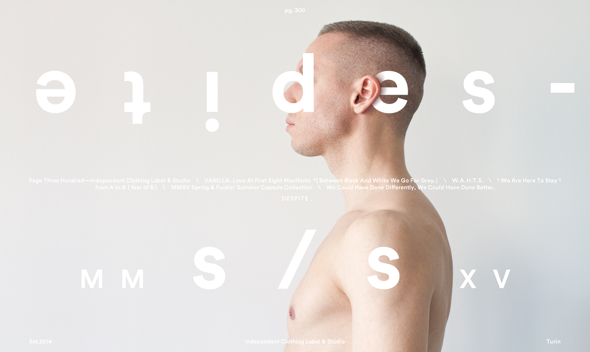
MM s/s XV
Spring & Fuckin’ Summer

Part I.
MMXV Spring / Summer Capsule Collection
Spinoff Limited Edition Sack Packs Series
No I. from A to B (26—28) · No II. from A to B (1—19)
+
LOOKBOOK CREDITS:
Creative Direction & Styling: P/T/H Label&Studio
Photography: P/T/H Label&Studio in collaboration with Quiet Propaganda Studio
Model: Alicja Khatchikian

Part II.
MMXV Spring / Summer Capsule Collection
+
LOOKBOOK CREDITS:
Creative Direction & Styling: P/T/H Label&Studio
Photography: P/T/H Label&Studio in collaboration with Quiet Propaganda Studio
Models: Alicja Khatchikian, Diego Federico

unpin

from A to B ( fear of B )

MM s/s XV
Spring & Fuckin’ Summer

Part I.
MMXV Spring / Summer Capsule Collection
Spinoff Limited Edition Sack Packs Series
No I. from A to B (26—28) · No II. from A to B (1—19)
+
LOOKBOOK CREDITS:
Creative Direction & Styling: P/T/H Label&Studio
Photography: P/T/H Label&Studio in collaboration with Quiet Propaganda Studio
Model: Alicja Khatchikian

Part II.
MMXV Spring / Summer Capsule Collection
+
LOOKBOOK CREDITS:
Creative Direction & Styling: P/T/H Label&Studio
Photography: P/T/H Label&Studio in collaboration with Quiet Propaganda Studio
Models: Alicja Khatchikian, Diego Federico


Collection Items

Man

( 5 )

01.Grey Cotton Shirt, Mandarin Collar
02.Double Fabric Shirt, Short Sleeve
03.Oversize Printed Shirt
04.from A to B ( n. 1 ) Screen Printed Tee
05.from A to B ( n. 2 ) Screen Printed Tee

Woman

( 5 )

06.Knickerbocker Yarn Sweater
07.Oversize Top, Back Placket
08.Cotton Shirt, Hemmed Harmhole
09.Printed Hemmed Harmhole Shirt
10.Printed Loose–fit Ankle–Length Trousers

Both

( 2 )

11.Oversize Black Kimono Raincoat
12.Printed Acetate Raincoat

Accessories

Both

( 2 )

01.No I. from A to B ( 26—28 ) Printed Acetate Sack Pack
02.No II. from A to B ( 1—19 ) Printed Acetate Sack Pack

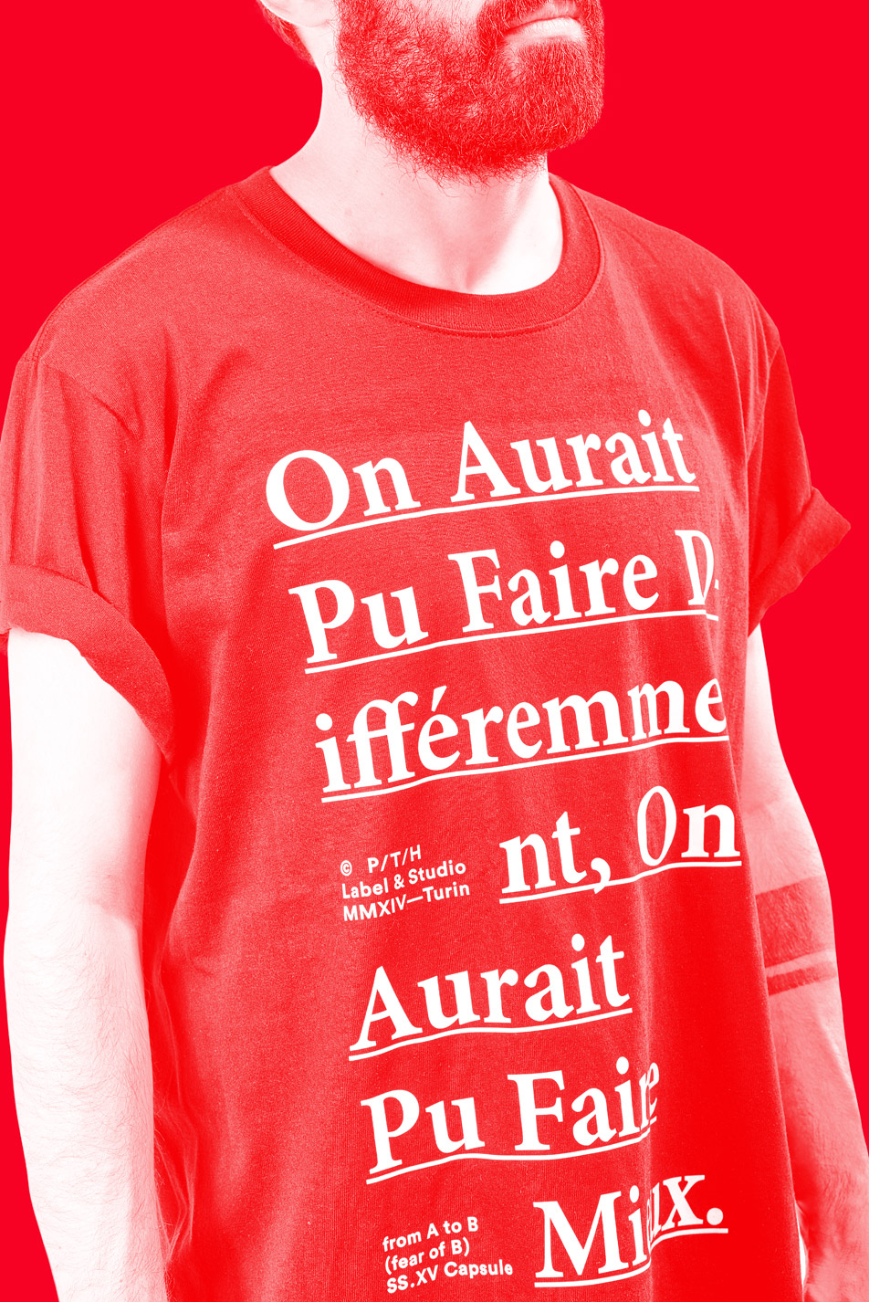
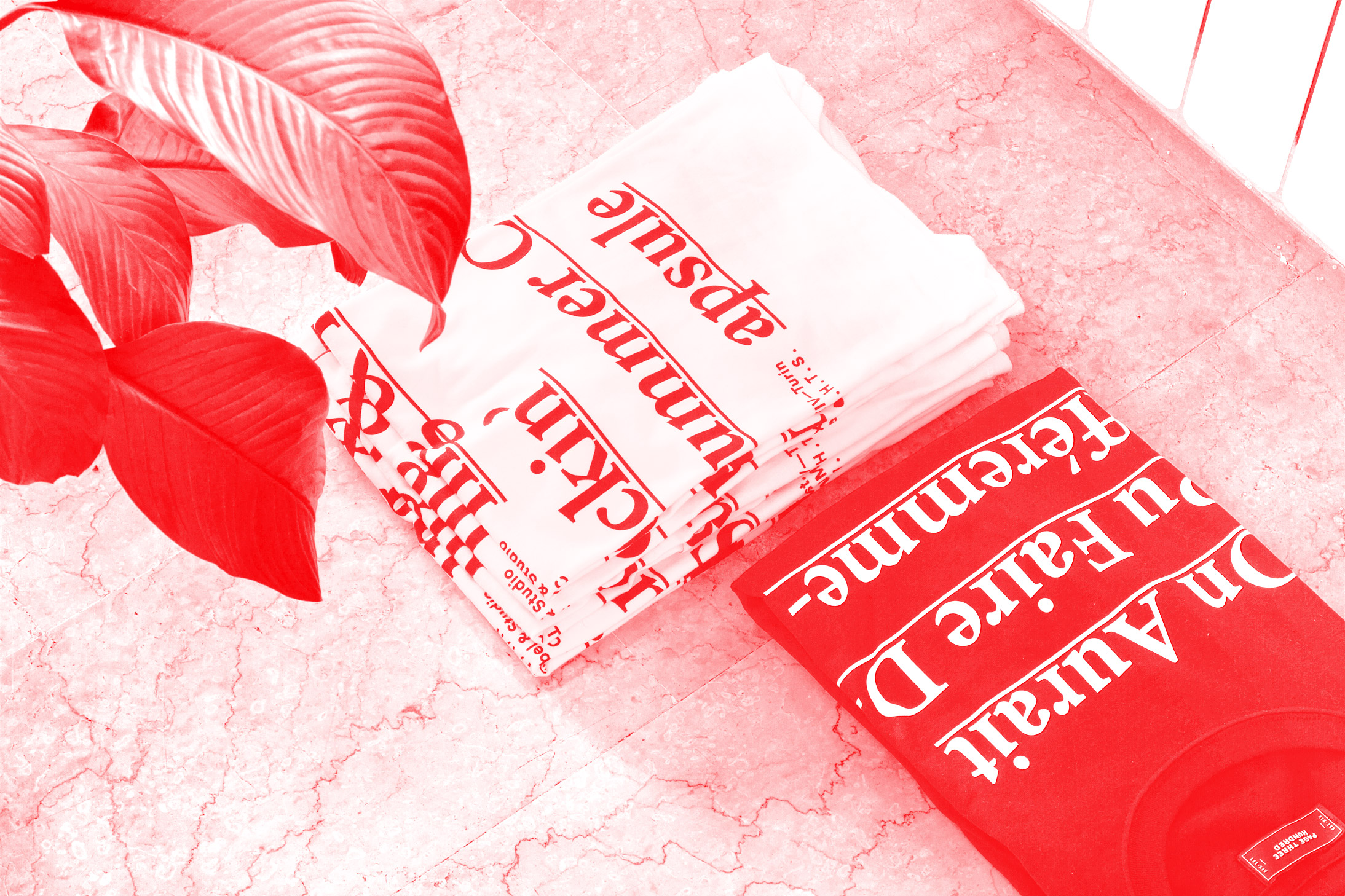
from A to B (fear of B) MMXV Capsule Collection · ( n. 2 ) Screen Printed Tee


P/T/H Label&Studio

pg. 300

Page Three Hundred is a Turin–based Independent Clothing Label and Creative Studio founded in 2014 by Gabriele Marchi and Maria Fernanda Barbero.
Three hundred is the natural number following two hundred and ninety–nine and preceding three hundred and one.


Colophon

from A to B
MMXV
Spring / Summer
Capsule
*
Part I.
Spinoff Sack Packs Series
*
Part II.
from A to B Main Capsule

P / T / H
Page Three Hundred
Label & Studio
( Est. 2014—Turin )
pagethreehundred.com
*
Follow On:
Behance, Facebook,
Tumblr, Vimeo

ONLINE SHOP
Big Cartel
*
Previous Collection:
Grey
MMXIV Fall / Winter
Capsule
( VANILLA, Love At First Sight Manifesto )

©

15 11 15

http://pagethreehundred.com/collections/15SS/from-a-to-b.html

You May Also Like:
GRRRREY, 2014 Fall/Winter Capsule
2014 Spin-Off Tees Collection
Stanislavski’s Method, Limited Edition Fine Art Prints
(2 series, 9 posters)
Label & Studio Website + Misc.

Family & Friends:
Quiet Propaganda Studio

Drop Us A Line:
hello@pagethreehundred.com

High All The Time.